
Earlier this year the Obama administration announced the expansion of the 2012 Deferred Action for Childhood Arrival (DACA) program, creation of the new Deferred Action for Parental Accountability (DAPA) program, and several other executive changes to the US immigration system. In response twenty four states, led by Texas, have filed suit against the Obama administration.
Their alleged concern is that the policy change will cause them to extend benefits to illegal aliens. This claim is not without warrant. Deferred Action not only grants recipients work permits, but also ‘legal presence’ which might make DAPA recipients eligible for some welfare programs depending on the state in question. I sympathize greatly with open border critics whose concern is over the fiscal cost of migrants. Indeed, if the states involved in the lawsuit were acting solely with the goal of addressing the fiscal cost of illegal aliens I would wish them the best of luck.
However once you start looking at the data it becomes clear that the fiscal cost of illegal aliens is not the reason why these states have elected to file their lawsuit. If the fiscal cost was so great we would expect those states with the largest share of the illegal alien population to be leading the fight. Yet California, housing 22% of all illegal aliens in the US, is notably absent from the lawsuit.
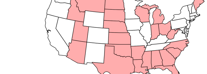
Indeed most of the states involved in the lawsuit have a tiny portion of the nation’s illegal aliens. At time of writing the following states have joined the lawsuit: Alabama (1%), Arizona (4%), Arkansas (0%), Florida (7%), Georgia (4%), Idaho (0%), Indiana (1%), Kansas (1%), Louisiana (1%), Maine (0%), Michigan (1%), Mississippi (0%), Montana (0%), Nebraska (0%), North Carolina (3%), South Carolina (0%), North Dakota (0%), Ohio (1%), Oklahoma (1%), South Dakota (0%), Texas (14%), Utah (1%), West Virginia (0%), and Wisconsin (1%).
I have constructed and included below a linear probability model, and probit model, where I find the probability of a state having filed lawsuit given its illegal alien population as a percentage of its total state population. If fiscal cost is a significant motive then we should expect a positive correlation, with those states with a large illegal alien population being more likely to have signed onto the lawsuit.
My findings? There is negative, albeit very weak, correlation. That is to say that states with a larger portion of their population as illegal aliens are less likely to have filed the lawsuit.

None of this should be taken to mean that the fiscal cost of providing welfare to migrants should be ignored. Migrants are already disqualified from most federal welfare benefits, but several states could reform their local welfare benefits nonetheless. If excluding migrants from welfare benefits is not politically feasible then they should at least be made to pay state taxes in order to allow states and other local governments to recoup some of their loses.


Estimates of illegal alien counts come from the Pew Research Center (Table A3). Data set modified from John Lee’s earlier post on comparing US states by their illegal alien population.
Further Reading:
Open Borders: The Case page on Political Externalities.
Zachary Gochenour and Alex Nowrasteh on the Political Exernalities of Immigration.
The fact that Maine is suing the federal government over illegal immigration cracks me up. Those darn Canadians, coming here, stealing our non-free healthcare!
Am I right in understanding that the vertical axis of the chart, which is labelled “Probability of Lawsuit,” refers to the PREDICTED probability of a state participating in the lawsuit against the federal government; predicted, that is, on the basis of the probit model? I suppose that sort of works… but it’s a strange chart. Usually when I look at charts whose purpose is to elucidate a regression analysis, the points show the REAL DATA, and some sort of regression line is used to indicate the prediction. That enables the reader to “eyeball” the real data and get an independent intuition of how plausible the regression result is, while simultaneously looking at the regression result. In this case, the states would be clustered at the top and bottom of the chart (since they either did sue, or didn’t) and a regression line would run through the middle of the points. At least, I think that’s what it would look like, but you’re the one who was working with the data.
Yes you’re correct the chart shows the predicted probability based on the probit model.
As I pointed out to Vipul I was conflicted on how to display the results. I could, as you suggest, show the real data and include the line of best fit, but I worry whether the casual reader would understand. That is why I also included the linear probability model.
What are your thoughts? What do you think is a good example of how to write when using regression results?
You have more experience than myself so I defer to your judgment.