
Today, we are announcing some finalists for our Open Borders Logo Contest. The finalists are arranged in chronological order (earliest first). The winner will be announced next week. Feel free to use the comments space to share your thoughts on the finalists.
#1: Global access, by Alexandria Fraga
Author’s description of the logo: The logo represents the right and access to move freely without restrictions.
On Facebook here.
#2, by Niklas Blanchard
On Facebook here.
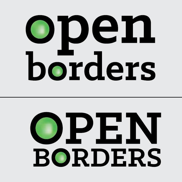
#3, by Katie Hartmann

On Facebook here.
#4, by Katie Hartmann
On Facebook here.
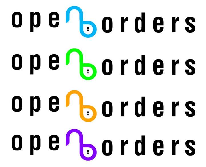
#5, by Martin Sykora
On Facebook here.
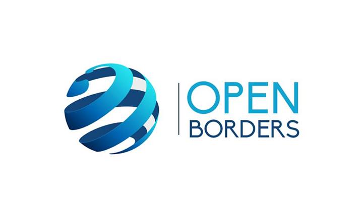
#6, by Kelsey Crockett
On Facebook here.
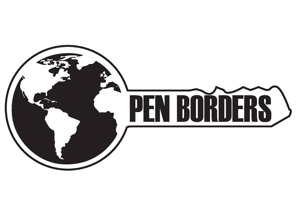
#7, by Niklas Blanchard
Author’s description of the logo: As a passionate advocate of open borders, and the free movement of people between countries, I wanted to create a logo that exemplified the breaking of barriers. The rotation of one of the links of the “fence” symbolizes this, while also creating an arrow, signifying movement. I flipped the logo at the suggestion of another member to point toward the words “open borders”, subtly suggesting that free immigration is the way forward.

On Facebook here.
We were also alerted to an image showing fence chains becoming birds shown below (original here) that could be combined with our final logo to create a good Open Borders T-shirt.

I like, in this order, #5, #7, and #3.
#5: This symbol is open, and it’s global. I’m not committed to the color. And I’d be open-minded to making the termini arrows. Unfortunately, it does remind one of the AT&T logo.
#7: I like this quite a bit, though I worry that it suggests blowing something up. If the detached piece could be made to look more like an opening hinge it might be better. I recently drew this on a chalkboard at my table at a bar, so at least it’s easy to draw.
#3: This seems mostly harmless, and elegantly gets across the idea of translation through a boundary without it looking like the boundary is being violated. Green is good for the arrow, but orange might be too hot of a color. Maybe light blue would be better for the “border”.
I was never on board with the traffic light idea, #6. I don’t like the lock and key stuff, though I will say #2 is better than #1. I also really don’t like the peace symbol #4; reminding people of hippies is the last thing we want.
I like #4 best, then #5.
I like number seven! But I would say that, I suppose.
Outside of my own submissions, I like number three. Katie is definitely very talented! I also like number five, but I think it is too similar to the AT&T logo.
#7 is the clear choice.
I like #7 and #2 in that order. I don’t like #5 because although it’s aesthetically appealing, it’s too similar to the AT&T logo, and I don’t see any immediately apparent symbolic connection to open borders, other than the globe. I really really like #7 because the symbolic connection to the action of opening the borders is immediately apparent, and because it’s so easily drawable/reproducible. I also like #2 because of how it incorporates itself into the name of the movement, but I worry it isn’t that effective as a standalone logo minus the words. I also am not terribly fond of the neon colours.
You’re not worried #7 looks too much like a Tetris action shot? 🙂
At least the Tetris action shot isn’t the trademarked logo of a multimillion dollar enterprise with widespread brand recognition! :p
Wow, cool! I love artists!
None of them really drew me to them. I think I would design one with a futuristic bridge.
The meaning of the bridge of course is to cross over two different pieces of land.
If I put in LOTS of time, I can do some graphics work, it is not work I do very often and it is not intuitive for me so I don’t have a completed concept in my mind. But I think I would have a bridge and then people crossing over it. None of these Logos show people. The human aspect is completely missing in all of them.
The fence logo could have shown a fence slit down the middle or ripped open, and then showing the back of a person. You have to think logo size so you can’t get to detailed. I think maybe a bridge with a person on it and a welcoming person on the other end with outstretched arms. Done very contemporary. The concept is not about an innate border it is about people. It’s about people being able to move freely. Well that is my take on it.
Or maybe like a stone wall, where the middle has been pushed through, opened up. And using perspective you see a person in the distance who has moved through the wall.
The key. And the chain-link image is incredible. Definitely use that, to death.
My favorite is number 2.
Logo-wise, nothing here really grabs me, but WOW I love the chain-link-to-birds imagery and would happily plunk down money to have that on a poster for my office or on a t-shirt~
#1 and #4
1 and 7 – first is serious and effective looking, last is light and free. Good for different uses/styles of working. I would love a t-shirt with the last one (not the first) but I might answer a letter with the first letterhead not the last.
#7, #3
I think #7, then #4. Those are the most versatile logos.
I like #2 because the symbol of leaving things “unlocked” captures the sanity of open borders in full.
http://sharvatechnology.myorderbox.com/